Brand
Brand & Design
The official reference for the Axolix identity: the logo assets that ship with the project, the colours the website actually uses, the type system, and the rules that keep anything new recognisably Axolix. Values come from the site's own files — proposed colours are labelled as proposals, never presented as the live palette.
Brand overview
Axolix is the Discord bot and dashboard for Roblox and ERLC communities — staff ranks that are real Discord roles, with the logs and permissions behind them. The visual identity is deliberately quiet: a dark neutral ground, clear white type, muted greys for support, and purple only where something is actionable.
- Ground. One continuous charcoal surface runs from navbar to footer on every route. Sections do not own their own backgrounds; depth comes from a single page-length tonal gradient and a fine film grain.
- Type. White for what matters, muted grey for support, faint grey for captions — each step chosen to clear WCAG 2.2 AA on the charcoal.
- Accent. #5500D4 fills primary actions; #C0A2FF carries eyebrows, links and every focus ring. Purple is never a large field behind content.
- Imagery. The one piece of artwork is the 3D Axolix render — lit, floating on transparency, decorative by role.
- Restraint. Hairline borders, no drop shadows, no glow shapes: hierarchy comes from spacing, weight and tone.
Logo library
Every asset below ships in website/public/ and is exactly what the site itself loads — the previews are the files, not redraws. Nothing here was generated for this page.

Axolix mark
Primary brand mark: navbar and footer lockups, and the site favicon (index.html links this same file).
- Format
- SVG (vector)
- Dimensions
- Square — 190.70526 × 190.70526 viewBox units

AxolCad mark
Product mark for AxolCad, the ERLC CAD module — use only beside that product's name.
- Format
- SVG (vector)
- Dimensions
- Square — 190.70526 × 190.70526 viewBox units

AxoMod mark
Product mark for AxoMod, the moderation module — use only beside that product's name.
- Format
- SVG (vector)
- Dimensions
- Square — 190.70526 × 190.70526 viewBox units
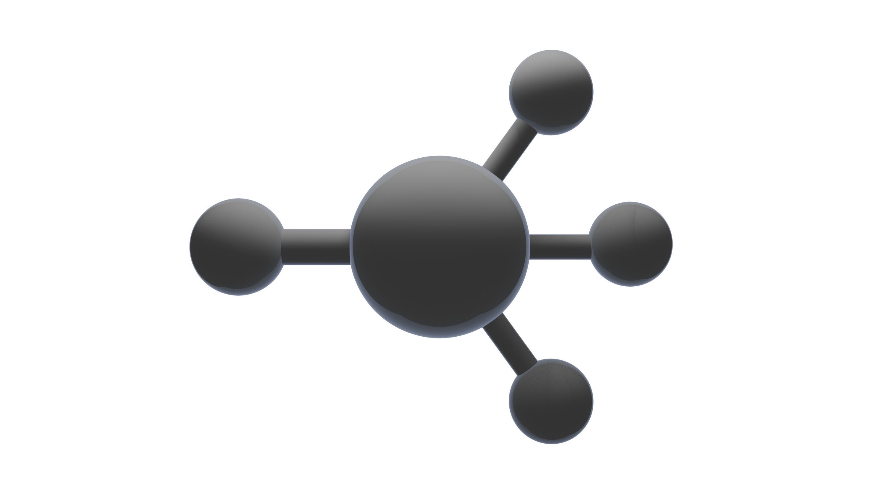
3D hero artwork
Homepage hero render — the only artwork in the system. An identical copy also ships as Axolix Hero.png.
- Format
- PNG with transparency
- Dimensions
- 2880 × 1620 px (16:9)
Wordmark
Set in type: the site's own sans stack, bold, tight tracking (the navbar lockup renders it at text-lg). No separate wordmark file exists — the wordmark is text wherever it appears, so there is nothing to download.
Axolix lockup
Mark beside wordmark, composed at runtime exactly as the navbar and footer render it. No lockup file exists either; the mark's alt is empty because the wordmark next to it already carries the name.
- No light variants exist. The marks are drawn with white strokes around the purple node, so they are dark-surface assets. No monochrome or light-background versions ship with the project, and none have been invented for this page.
- The favicon is not a separate file: the site's index.html points the favicon at /Axolix_Axolix.svg, the same primary mark.
Colour palette
The current palette, taken one-for-one from the design tokens in src/index.css — the single source of truth the whole site reads from. These are the colours Axolix uses today.
Page backgrounds
One page-length gradient runs through every route — these are its stops.
Charcoal
#1D1E21 · --bg
The base page background behind every route.
Charcoal, deep
#191A1D · --bg-subtle
Footer grounding — where the page gradient settles.
Tone, mid
#18191C · --tone-mid
Deepest stop of the continuous background gradient (mid-page).
Tone, lower
#1C1D21 · --tone-lower
The slight lift before the footer, in the same gradient.
Surfaces and borders
Panel
#25262B · --panel
Product cards and grouped content surfaces.
Panel, strong
#2D2E34 · --panel-strong
Raised surfaces: dropdown panels and inputs.
Line
#3D3F46 · --border
Hairline rules, card outlines and dividers.
Line, strong
#4E505A · --border-strong
Interactive borders — secondary buttons, focused fields.
Text
Ink
#F4F4F6 · --text
Headings and primary text.
Ink, muted
#A7ABB3 · --text-muted
Supporting copy and secondary labels.
Ink, faint
#90949C · --text-faint
Captions and tertiary metadata.
White
#FFFFFF · text-white
Labels on purple fills (primary buttons) and the selection highlight.
Brand purple
Purple stays selective — actions, links, focus and small accents, never large fields behind text. The full 50–950 ramp exists in the tokens; these are the stops the stylesheet actually uses.
Axolix purple
#5500D4 · --brand-600
The brand accent: primary buttons, active-nav underline, selection.
Purple, pressed
#4A00B8 · --brand-700
Pressed/active state of primary buttons.
Purple, hover
#7B2CF0 · --brand-500
Hover fill of primary buttons; accent rules on callouts.
Purple, line
#9F6BFF · --brand-400
Hover borders and link underline decoration.
Purple, eyebrow
#C0A2FF · --brand-300
Eyebrows, links, module titles and every focus ring — the text-safe purple.
Purple, light
#DBC9FF · --brand-200
Hover colour for purple links on charcoal.
Purple, pale
#EDE4FF · --brand-100
Code blocks in long-form articles.
Status
From the tokens: feedback text only, where the meaning demands it.
Success
#34D399 · --success
Positive feedback text.
Warning
#FBBF24 · --warning
Caution notices and warnings.
Danger
#F87171 · --danger
Destructive actions and errors.
Text and accent combinations in use
Ratios are computed in this page from the exact hexes above, using the WCAG 2.2 relative-luminance formula. AA needs 4.5:1 for body text. The numbers are carried in text, not signalled by colour alone.
| Combination | Ratio | Assessment | Intended use |
|---|---|---|---|
| Ink on Charcoal | 15.17:1 | Passes AA for body text — 15.17:1 (needs 4.5:1). | Headings and primary text |
| Ink, muted on Charcoal | 7.24:1 | Passes AA for body text — 7.24:1 (needs 4.5:1). | Supporting copy |
| Ink, faint on Charcoal | 5.48:1 | Passes AA for body text — 5.48:1 (needs 4.5:1). | Captions and metadata |
| Purple, eyebrow on Charcoal | 7.82:1 | Passes AA for body text — 7.82:1 (needs 4.5:1). | Eyebrows, links, focus rings |
| White on Axolix purple | 8.99:1 | Passes AA for body text — 8.99:1 (needs 4.5:1). | Primary button labels |
| Ink, muted on Panel, strong | 5.88:1 | Passes AA for body text — 5.88:1 (needs 4.5:1). | Dropdown and input text |
Proposed colour variations
Suggestions, not the live palette
None of the colours below are in the design tokens. They are proposed extensions — kept dark and restrained to match the identity — and would only become official by being deliberately added to the site's tokens. Every swatch shows its exact hex, its intended use, and a contrast assessment against the charcoal.
Void
#0F1013
Deepest ground: modal backdrops and overlays beneath floating surfaces.
1.14:1 against charcoal — surfaces and decoration only, not for text.
Raised charcoal
#212226
A quiet tier between the page and card panels — inset rows, secondary surfaces.
1.05:1 against charcoal — surfaces and decoration only, not for text.
Silver
#C9CCD2
Emphasised secondary text: sub-headings and lead-ins that sit between ink and muted grey.
Passes AA for body text — 10.36:1 (needs 4.5:1).
Steel
#7A8CA6
Informational accents on charcoal: quiet links, info callout rules.
Passes AA for body text — 4.86:1 (needs 4.5:1).
Violet
#8A5CF5
Larger purple accents: section numbers, icon strokes, hover emphasis.
Passes AA for large text and UI — 3.91:1 (needs 3:1).
Mauve rule
#6D5BA6
Restrained accent rules and underlines — a desaturated purple that sits quietly beside #5500D4.
2.93:1 against charcoal — surfaces and decoration only, not for text.
Indigo wash
#3B1E9E
Deep, cooler purple for ambient gradient depth; never for text.
1.48:1 against charcoal — surfaces and decoration only, not for text.
How the proposals behave on real backgrounds
Each combination is assessed for the use it is suggested for: 4.5:1 for body text, 3:1 for large text and non-text interface elements. Rows that fall short are marked decorative — never dressed up as accessible.
| Combination | Ratio | Assessment | Intended use |
|---|---|---|---|
| Silver on Charcoal | 10.36:1 | Passes AA for body text — 10.36:1 (needs 4.5:1). | Sub-headings and lead-in text |
| Steel on Charcoal | 4.86:1 | Passes AA for body text — 4.86:1 (needs 4.5:1). | Informational links and accents |
| Violet on Charcoal | 3.91:1 | Passes AA for large text and UI — 3.91:1 (needs 3:1). | Large headings and icon strokes |
| Mauve rule on Charcoal | 2.93:1 | 2.93:1 against charcoal — surfaces and decoration only, not for text. | Accent rules and underlines only |
| Ink on Void | 17.32:1 | Passes AA for body text — 17.32:1 (needs 4.5:1). | Text on the proposed deepest backdrop |
| Silver on Raised charcoal | 9.88:1 | Passes AA for body text — 9.88:1 (needs 4.5:1). | Text on the proposed raised surface |
Typography
One type system for the whole site: the operating system's own sans stack — no webfont download, nothing to flash — plus a monospace stack for identifiers and code. This page introduces no new font.
Sans (body, headings, UI)
ui-sans-serif, system-ui, -apple-system, "Segoe UI", Roboto, "Helvetica Neue", Arial, "Noto Sans", sans-serif
Mono (identifiers, code)
ui-monospace, SFMono-Regular, "SF Mono", Menlo, Consolas, "Liberation Mono", monospace
What Axolix is
.eyebrow — xs, semibold, uppercase
How Axolix works
h1 — bold (700)
Three modules, one platform
h2 section — bold (700)
Staff management
h3 card — semibold (600)
Body copy carries the primary text colour at regular weight.
body — regular (400)
Supporting text steps down to the muted grey rather than shrinking further.
small — muted support
link — medium, brand-300
The hierarchy runs on weight and colour before size: h1 and h2 are bold (700) with tight tracking and balanced wrapping, h3 is semibold (600), body is regular (400) at 1rem with 1.6 line-height (long-form prose opens up to 17px / 1.75). Secondary information steps down by colour — ink, then muted, then faint — before it ever steps down by size.
Design principles
- Neutral dark-grey foundation. One continuous charcoal surface per page — no section brings its own background, so the site reads as a single environment.
- Clear white primary typography. Headings and key text sit in #F4F4F6; nothing important is set in a grey.
- Readable secondary text. Support copy steps through #A7ABB3 and #90949C — both stay above AA on the charcoal, so quieter never means unreadable.
- Selective purple. #5500D4 marks where a user can act; #C0A2FF marks where they can read or focus. Purple never becomes a page-sized fill.
- Controlled atmosphere. Gradients are tonal — a few grey values stretched over the whole page — plus one fine grain film and a single purple wash. No blobs, glows or hard bands behind content.
- Consistent spacing and alignment. One centred column family (max-w-4xl for articles, max-w-6xl for marketing sections) with the same vertical rhythm throughout.
- Minimal, purposeful borders. Hairline #3D3F46 rules divide and outline; cards lift by tone, not by shadow or heavy frames.
- Accessible contrast, visible focus. Every text pair meets WCAG 2.2 AA, and every interactive element shows the same 2px #C0A2FF focus ring.
Applying this to a new page or product surface: start on the shared charcoal, add nothing that carries its own background, put purple only where a user can act, keep every text pair above AA — and let spacing, not boxes, do the grouping.
Logo usage & accessibility
How the site uses the assets today
- Lockup. Navbar and footer render the mark at a fixed height (h-7, 28px) beside the wordmark; the mark is decorative (alt="") because the visible wordmark already names the brand.
- Favicon. The primary SVG, directly — no separate icon build.
- Hero render. Decorative and hidden from assistive technology on the homepage; the wordmark and headline carry the meaning. In this page's library it is identified, because there the asset itself is the subject.
- Product marks. AxolCad and AxoMod marks appear only where those products are named.
Recommendations — not official brand rules
The project contains no documented minimum sizes or clear-space figures, so none are stated here. The following is proposed guidance for keeping the assets intact:
- Keep proportions. Set one dimension (height) and let the SVG's own ratio do the rest — exactly what the site's Logo component does. Setting width and height together distorts the mark.
- Do not crop or obstruct. Never trim the mark's edges or lay text across the node; the hero render keeps its transparent margins when scaled.
- Mind the contrast. White-stroke marks need a dark ground; on light or busy backgrounds they disappear, and no light variant exists to fall back on.
- No unapproved effects. No shadows, outlines, recolours, gradients or rotation on the marks. The only sanctioned lighting in the system is the 3D render's own.
- Alt text. When the logo is the informative subject of an image, name it ("Axolix logo"). When it sits beside visible brand text, use empty alt so screen readers do not read the name twice.
- Pick the right asset. Mark alone for favicons, avatars and small squares; the lockup where horizontal room exists; product marks only next to their own product name.